Single-Serve Program · Concept Review

GROG

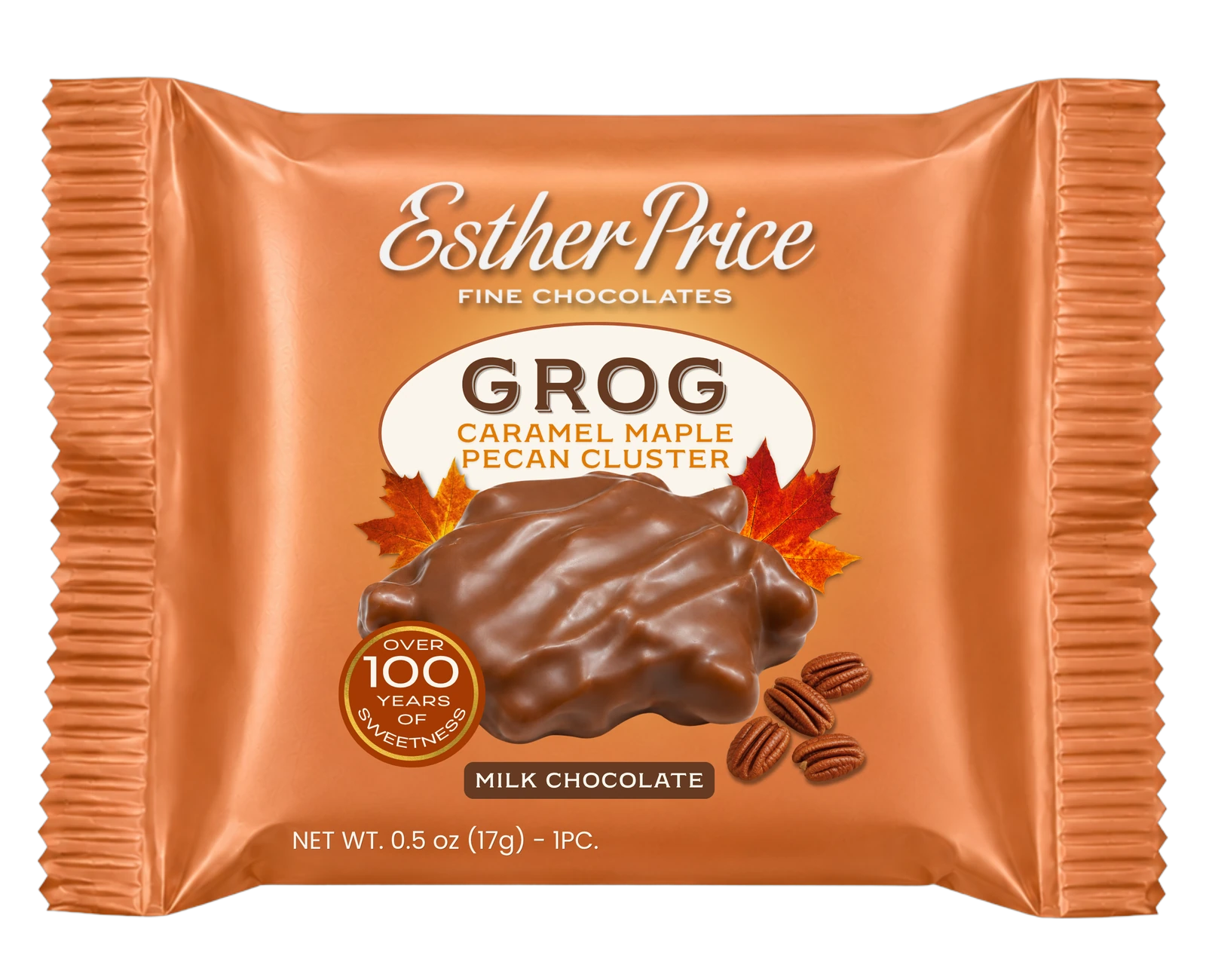
Caramel Maple Pecan Cluster. A single-serve wrapper built to stand on its own at the register — and to open the door for the whole one-piece line. The design is two screens down.

Client
Esther Price Fine Chocolates
Product
Caramel Maple Pecan Cluster · 1 pc
Format
Single-serve flow wrap
Status
Design comp for review
1926 · 2026 One Hundred
Years
Esther Price · Dayton, Ohio
Scroll

01 — Today

What the shelf looks like now.

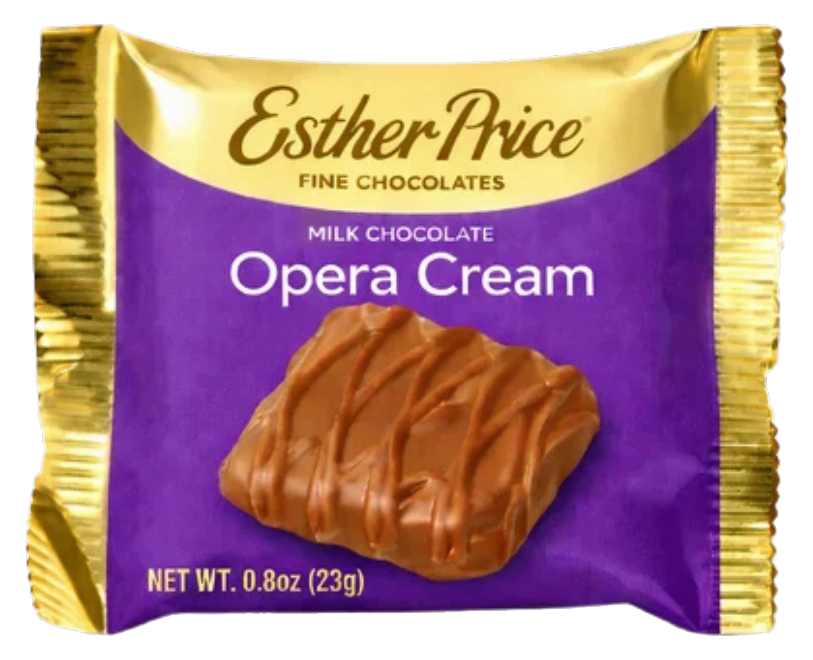
This is the visual language shoppers already know Esther Price by. It has real equity, and none of what follows throws it away.

  • Purple field, gold foil ends. Instantly recognizable, and the same on every piece in the line.
  • Script logotype on a gold arc. The strongest asset the brand owns.
  • Flavor set in plain type on the field. Readable up close, quiet from six feet.
  • No heritage claim anywhere on the pack. A hundred years of history, unmentioned.

The question this design answers: how do you extend that language to a flavor the purple pack can't carry — without making it look like somebody else's candy?

Current Esther Price single-serve wrapper, Opera Cream

02 — The Design

GROG.

Caramel Maple Pecan Cluster · Milk Chocolate · 1 pc

GROG Caramel Maple Pecan Cluster single-serve wrapper

03 — Side by Side

Your current look, next to this one.

Not a replacement — a reference point. Putting the two together shows exactly what this design keeps, what it changes, and what it adds. Drag the handle.

Current design language New design
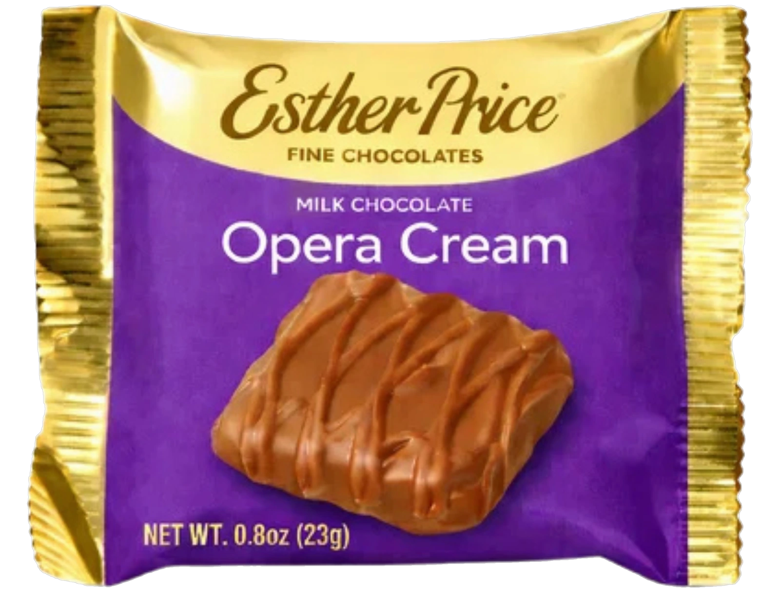
Current Opera Cream single-serve wrapper
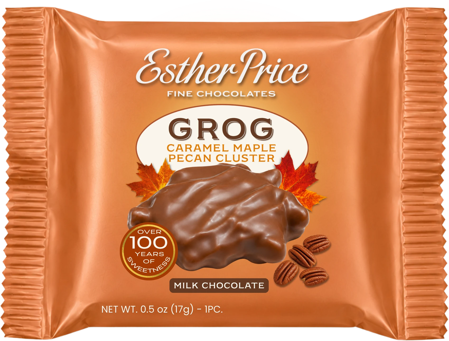
Proposed GROG single-serve wrapper

Both packs scaled to the same footprint so the comparison is honest.

Kept

Brand architecture

Script logotype locked to the top, "Fine Chocolates" beneath it, product shot centered, net weight bottom left, foil-crimp ends. A shopper who knows the purple pack navigates this one without thinking.

Changed

Flavor-coded field

Copper instead of purple, and a cream oval where the current pack runs type straight on the field. Caramel, maple and pecan are all warm-brown cues — the color now previews the taste before the words are read.

Added

Centennial seal

"Over 100 Years of Sweetness" — not on the current pack at all. It earns the price on a register-lane impulse buy, and it is the one thing a private-label cluster can never print.

04 — Anatomy

Every element, and the job it does.

Tap a marker on the pack, or any note in the list.

GROG wrapper with annotation markers

1Logotype & endorsement

Esther Price script with a soft white outer glow so it separates from the copper without a hard keyline. "Fine Chocolates" tracked wide underneath — the same lockup as the purple pack, unchanged.

2Cream oval & product name

GROG set large in a warm cocoa slab serif inside a cream oval. The oval is the single biggest departure from the current pack, and it earns its keep: it gives an unfamiliar name a quiet room to be read in.

3Flavor descriptor

"Caramel Maple Pecan Cluster" in maple orange, stacked two lines. GROG is a name nobody knows yet — the descriptor is doing the actual selling, so it sits directly under the name and never gets shrunk.

4Hero product shot

The cluster, straight on, with loose pecan halves at the base for texture and scale. Photographed, not illustrated — chocolate has to look edible or the price stops making sense.

5Chocolate-type bar

"Milk Chocolate" reversed out of a cocoa rounded bar. Reads as a variant marker, which means a Dark Chocolate SKU drops into the same slot with no relayout.

6Centennial seal

Gold-ringed "Over 100 Years of Sweetness" roundel, bottom left of the hero. Placed low so it registers after the flavor — it's a closer, not an opener.

7Crimp & substrate

Copper carries into the fin seal so the crimp reads as part of the design instead of a cut edge. The sheen is a metallic-substrate effect, the same way the current pack's gold ends work — it has to come off the film, not out of a photo.
06 — Shelf Test

Does it hold at distance?

A register-lane pack gets seen from four to six feet, at an angle, under bad light. Drag the slider. The left panel is the rack; the right panel holds the pack at a readable size and shows only the detail your eye is actually getting from that far away.

1.5 ft
On the rack
What your eye resolves
Net weight Flavor descriptor GROG name Esther Price logotype Copper field & cream oval